Disclosure:This post may contain affiliate links, meaning if you decide to make a purchase via my links, I may earn a commission at no additional cost to you. See my disclosure for more info.
Your living room is a key part of your home. It’s where you show your style and welcome loved ones. Choosing the right colors for your walls is key to making it feel cozy and inviting.
Choosing colors for your living room is more than picking your favorites. Experts say to use three to five colors for harmony. They suggest the 60-30-10 rule: 60% for the main color, 30% for secondary colors, and 10% for an accent.
For a cozy feel, Casey H. from Decorilla recommends rich reds with earthy tones. Joseph G. shows how elegant a gray gradient can be. You can choose bold colors or timeless neutrals, depending on your taste.
Key Takeaways
- Select three to five colors for your living room color schemes to ensure cohesiveness.
- Apply the 60-30-10 rule for balanced color distribution.
- Mix rich reds with earthy tones for a cozy, inviting feel.
- Gray gradients offer a sophisticated and welcoming atmosphere.
- Neutral colors like whites, creams, and grays provide a timeless look.
Understanding the Impact of Your Living Room Color Palette
Choosing paint colors for your living room walls is more than a personal preference. It’s a powerful tool that can change the mood and feel of your space. Bright, warm colors like reds, oranges, and yellows can make a room feel energetic and happy. They are great for creating a cozy living room.
Cool, subdued colors like blues, greens, and purples can create a calming environment. They help make your living room a peaceful and relaxing space.
Color psychology is key in interior design. It affects how a room feels and functions. For example, using an accent wall in cozy colors can highlight the space. Neutral tones can make a small living room look bigger.
To understand how colors can change your living room, let’s look at some popular color schemes and their effects:
| Color Scheme | Colors | Psychological Effect |
|---|---|---|
| Nature-Inspired | Green, Yellow, Black | Connecting to nature, refreshing |
| Modern | Black, White | Clean, elegant, timeless |
| Eclectic | Orange, Green | Energetic, creative |
| Beach-Inspired | Turquoise, Pink, Yellow | Relaxed, cheerful |
| Moody | Charcoal, Vibrant Citron Green | Dramatic, thought-provoking |
| Traditional | Neutrals, Mustard Yellow | Comforting, familiar |
Each color palette has its own effect on a living space. Knowing these effects can help you pick the right colors for your living room. Whether you prefer the lively feel of eclectic colors or the calm vibe of beach-inspired hues, the right colors can turn your living area into a cozy and stylish haven.
Popular Living Room Color Schemes to Consider
Choosing the right colors for your living room is key. Looking at different color schemes can spark ideas and make your space welcoming. Here, we’ll explore some top living room colors and modern ideas to refresh your area.
Moody Modern
The moody modern look is bold and elegant. It starts with dark blacks and cool grays. Adding deep colors like oxblood and cognac adds depth and a touch of edginess.
Warm & Retro
Love the 1970s? The warm & retro scheme is for you. It uses bright marigold and browns for a cozy feel. Adding cool colors brings a modern contrast.
Subtle Jewel Tones
Prefer softer colors? Jewel tones like ruby and sapphire are great. They look good with neutral colors, adding warmth without being too much. These colors bring sophistication and a hint of retro.
| Color Scheme | Main Colors | Accents | Percentage of Schemes |
|---|---|---|---|
| Moody Modern | Black, Cool Gray | Oxblood, Cognac | 30% |
| Warm & Retro | Marigold, Brown | Cool Hues | 30% |
| Subtle Jewel Tones | Ruby, Sapphire | Neutrals | 20% |
Trying out these colors can really change your living room’s feel. Pick a palette that fits your style for a modern, welcoming space.
Choosing Paint Colors for Living Room Walls
Choosing paint colors for your living room walls is a big decision. It can change the whole feel of your space. You can pick from calming neutrals or bold colors that show off your style. Let’s explore some popular choices that can make your living room stand out.
Neutral Paint Colors
Neutral colors are great because they work with any decor. They let natural light in and make small spaces look bigger. Benjamin Moore’s White Dove OC-17 and Stardust 2108-40 are classic choices. They add a touch of elegance.
Greige tones, like Balboa Mist OC-27, are also popular. They mix gray and beige for a balanced look. Soft whites and pastel hues are also good for creating a cozy feel. Winter Gray 2117-60 and Dolphin AF-715 are favorites for their calming effects.
Bold and Vibrant Options
If you want to add personality to your living room, bold colors are the way to go. Colors like Benjamin Moore’s Black Raspberry 2072-20 and Hibiscus 2027-50 can make a statement. They’re perfect for highlighting special features in your room.
There are also vibrant colors inspired by different styles. Gentleman’s Gray 2062-20 is great for a vintage look. Gossamer Blue 2123-40 adds a modern touch. Warm colors, like Fairmont Green HC-127, work well with terracotta for a cozy feel.
The 60-30-10 rule helps keep your design balanced. It means 60% of the room should be one color, 30% another, and 10% an accent. If you love bold colors, consider deep browns or bright reds, oranges, and yellows to energize your space.
| Paint Color | Type | Best Used For |
|---|---|---|
| White Dove OC-17 | Neutral | Reflecting light, timeless backdrop |
| Black Raspberry 2072-20 | Bold | Creating focal points |
| Gossamer Blue 2123-40 | Vibrant | Adding a refreshing feel |
| Gentleman’s Gray 2062-20 | Bold | Vintage-style living rooms |
| Winter Gray 2117-60 | Neutral | Creating calm and serene spaces |
Modern Living Room Color Ideas to Inspire You
Choosing the right colors for your living room is key. Modern living room color ideas often include bold combinations and standout shades. These can make any space pop. Here are some top picks to think about:
Blue is a top pick in interior design. It brings calm and tranquility. Deep, dark blues are great for workspaces. Softer blues are better for bedrooms and traditional rooms.
Green is another best color for living room walls. It creates a calm, grounding feel. It works well with neutrals and earthy tones, adding freshness to any room.
Pale rose shades are gaining popularity. They add a delicate touch when paired with bold pastels. This mix is perfect for modern interiors.
White is all about lasting harmony. It’s timeless and versatile. It looks great with marble, glossy surfaces, mirrors, and white textiles. It’s a great base for many styles.
Brown adds warmth and coziness. It’s inviting when paired with deep navy blue, gold, burnt orange, or mint green. This mix creates a welcoming atmosphere.
Neutral pink is a new favorite for living rooms. It’s surprisingly subdued. It pairs well with deep reds for sophistication or bright oranges and turquoises for a bold look.
Stripes can add excitement to a living room. They’re popular in the Palm Beach Villa living room. They make a space feel longer and taller.
Bold colors like bright pink, Barbie pink, and poppy red are trending. They show a move towards trying new things in decor.
Scenic wallpaper can make a big statement. It’s seen in places like the Chicago prewar apartment. It creates a dramatic yet unified look in the room.
Conclusion
Choosing the perfect living room color palette is a journey that makes your home unique. You can pick from cozy colors that feel warm or bold accent walls for drama. The right colors not only look good but also make you feel comfortable and fit your lifestyle.
Getting inspiration from shows like “Grace and Frankie” can help you create your own style. Colors like green and navy can make a big statement in your living room. Using digital mood boards and ordering swatches helps you see and test colors before you decide.
Experts say it’s key to choose colors that go well together, like blue and orange. Adding black and white can also make a big difference. They suggest painting connected rooms the same color for a smooth look. Dark navy or green can make a room stand out.
If choosing colors seems hard, getting help from a pro can make it easier. Using Armstrong Vinyl in the bedroom and BM Edgecomb Gray in the kitchen shows how colors can make each room special. Aim for a color scheme that tells a story and makes your living room perfect.
FAQ
What are the best colors for living room walls to create a cozy environment?
How should I choose paint colors for my living room?
What are popular living room color schemes for a modern look?
What accent wall colors are recommended for living rooms?
How can a living room color palette impact the overall feel of the room?
What are some modern living room color ideas that are trending?
Why are neutral colors considered a good choice for living room walls?
How can I make my living room feel more spacious with color?


About the author


Crafting Cheer: Creative DIY Christmas Decoration Ideas
Discover DIY Christmas decoration ideas! Create festive ornaments, upcycled decor, and magical outdoor displays.

Chic Boho Bathroom Ideas That Turn Your Space Into a Relaxing Retreat
Your bathroom should be more than a place to get ready — it should be your private retreat, a space that calms your mind and refreshes your soul.If you love a natural, free-spirited look that blends comfort with creativity, a boho-inspired bathroom might be exactly what you need. Boho design celebrates textures, colors, and handcrafted details that tell a story. Whether you’re starting fresh or simply updating a few pieces, these ideas will help you create a beautiful, grounded bathroom that feels like an everyday escape. 1. Start with Warm Neutrals and Earthy Hues The magic of a boho bathroom begins with its color palette. Soft whites, sandy beiges, terracotta, and muted greens set the stage for a warm, inviting vibe.Add pops of color through accessories — think mustard towels, terracotta vases, or a vintage rug underfoot. You can easily […]

Holiday Gift Guide for Teen Boys 2025: 25 Cool Gifts They’ll Actually Love
Shopping for holiday gifts for teen boys can feel like trying to decode a secret language — one that changes every few months. Whether he’s into gaming, gadgets, fashion, or outdoor adventures, this 2025 gift guide will help you find something that feels fun, personal, and totally on trend. Here are 25 ideas that will make you the MVP of this year’s gift-giving season. ⚙️ Tech & Gadgets – Cool Holiday Gifts for Teen Boys Teen boys and tech go hand in hand — they love gear that makes life easier, cooler, or just more fun. From wireless earbuds to smart projectors, these picks combine innovation with everyday usefulness. Wireless Earbuds for Small EarsFor the teen who’s always listening to music, a comfortable pair of earbuds that stay in place is a game-changer. With crisp sound and a secure fit, […]
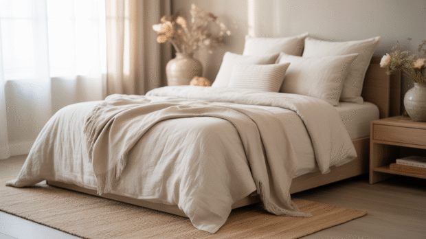
How to Design a Peaceful Bedroom Sanctuary
Your peaceful bedroom sanctuary should be more than just a place to sleep — it should be your personal retreat, a space that calms your mind and recharges your soul. You don’t need a full renovation to achieve this feeling. A few thoughtful choices in color, texture, and decor can transform your room into a calm and elegant escape. In this guide, you’ll discover how to bring balance, comfort, and timeless beauty to your bedroom using high-value decor pieces that elevate both your space and your mood. 1. Start with a Calming Color Palette for Your Peaceful Bedroom Sanctuary 🎨 Soft colors instantly relax the mind.Begin with neutral tones like ivory, beige, or light gray. Then add gentle accents — sage green, blush pink, or soft blue — to keep the space warm and welcoming. 🛍️ Shop the look: Luxury […]

Effortless Outfits for Busy Moms Who Still Want to Look Chic
Being a mom doesn’t mean giving up on style — especially when you’re working from home.These work from home mom outfits make it easy to feel put-together while staying comfortable all day. Between school drop-offs, Zoom calls, and endless to-do lists, most moms need work from home mom outfits that are quick, comfy, and still chic. After all, being busy doesn’t mean giving up on style. In fact, with a few smart outfit ideas, you can look polished in minutes. Here’s your ultimate guide to effortless, mom-approved outfits that blend comfort, confidence, and timeless style. Whether you’re jumping into a quick meeting or heading out for errands, these looks will help you feel put-together in minutes. 💖 1. Elevated Loungewear Sets: Effortless Work from Home Mom Outfits Forget old sweats. Instead, go for modern loungewear made of soft fabrics and […]
15 Smart Kitchen Essentials That Save Busy Moms Hours Every Week
If you’re a busy mom, you already know that every minute in the kitchen counts. Between school runs, work, and family dinners, you’re constantly juggling. That’s why investing in high-end kitchen appliances for moms isn’t just a luxury — it’s a lifesaver. These smart, time-saving essentials transform your everyday cooking routine into a seamless experience. Moreover, they help you enjoy restaurant-quality meals without spending hours in the kitchen. Whether you’re blending a morning smoothie, baking fresh bread, or letting your multicooker do the heavy lifting, each of these tools is designed to give you back your time — and your peace of mind. 1. High-Performance Blender Think beyond smoothies. A high-end blender can handle everything from soups to nut butters to frozen cocktails with effortless precision. Moreover, modern smart blenders feature preset programs that automatically adjust speed and time — […]

How to Make Car Travel With a Baby Stress-Free (and Actually Enjoyable)
Traveling with a baby can feel like a huge task at first — packing everything, anticipating every possible meltdown, and worrying about comfort and safety. But with a little planning and the right gear, it can actually be a pleasant and memorable experience. Whether you’re driving across the state or just visiting relatives, car travel with your little one doesn’t have to be stressful. With the right approach, it becomes an opportunity to bond, explore, and enjoy new experiences together. 1. Pack the Essentials (and Then Some) The secret to a peaceful car trip with your baby is preparation. Before you even start the engine, make sure you have everything your baby might need — and then a few extras, just in case. Here’s a simple baby travel checklist to guide you: Diapers and wipes (always bring more than you […]

14 Smart Office Gadgets Every Boss Mom Needs to Stay Productive
If you’re looking for smart office gadgets for boss moms who juggle work and family life, you’ll love this list! Let’s be real, Boss Mom — your days are full. Between morning chaos, client calls, school pickups, and that never-ending to-do list, it’s easy to feel like there aren’t enough hours in the day. But what if your workspace actually helped you stay organized, motivated, and even inspired? Creating a smart, intentional home office isn’t just about pretty décor — it’s about designing a space that supports your goals and your lifestyle. These 14 office gadgets aren’t just tech accessories; they’re quiet little helpers that make your day flow more smoothly. Whether you’re a freelancer, entrepreneur, or remote-working mom juggling multiple roles, these tools will help you stay focused, efficient, and in control — all while keeping that calm, confident […]
Related

15 Loft Bed Ideas for Small Spaces
Maximizing space in small rooms can be tough, but it's also a chance to be creative. Loft beds are a great solution. They offer a cozy sleeping spot and save floor space for other uses. Loft beds let you turn a room into a bedroom, workspace, living area, or storage spot. With 15 new loft bed ideas, you can make your small room stylish and useful. These ideas range from modern looks to smart storage. They'll help you see your space in a new light and use it better. Why Loft Beds Are Perfect for Small Spaces Loft beds are a smart choice for small spaces. They lift the bed up, freeing up floor space. This is great for compact rooms, making the most of every inch. Loft beds offer a chance to use the space below for different things. […]

Serenity Starts Here: Serene Blue Color Palette Selection Tips
Discover serene blue color palette selection tips for a tranquil home decor transformation. Serenity starts here!

Revamp Your Home: Modern Centerpiece Ideas to Freshen Up Your Space
Discover modern centerpiece ideas to freshen up your space with budget-friendly, DIY, and seasonal decor tips.

Captivating Beauty: Mason Jar Centerpiece Ideas to Impress
Discover stunning mason jar centerpiece ideas to transform your decor. Perfect for any occasion!

Upgrade Your Style: Elegant L-Shaped Sofa Designs for Every Home
Discover elegant L-shaped sofa designs to upgrade your style and create a cozy, inviting space in your home.

Transform Your Home: Creative DIY Decor Ideas for Every Room
Explore creative DIY decor ideas for every room in your home and transform your space into a stylish haven.